Design for Print
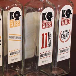
KO Hot Sauces
Hot sauce line with a boxing theme. Brand identity, packaging, advertising campaign, and trade show brochure.
My KO Hot Sauce concept brings together a wide range of designs. I was guided by a bold attitude and a sense of fun. The fictional company's brand identity uses a boxing theme, starting with a logo that incorporates the bell from ringside. This comprehensive project is a real knockout.
Each of the eight boxing weight classes are represented by cleverly named flavors ranging from very mild to super hot. The labelling is bold, clean, consistent, and color-coded. They are sure to stand out against the competition on store shelves.
The advertising campaign is built around the tagline 'Knock your socks off.' The literal images do most of the talking. They were montaged entirely from photographs I staged and shot.
The brochure was envisioned as a deluxe trade show piece. I made screen prints on canvas to create the cover, and laced the binding to recall a boxing ring. Part of the brochure introduces the company's founder and history, telling the story of how he started making hot sauce. The catalog section has tabbed pages for each of the sauces, describing the ingredients and heat values.
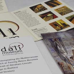
Dali Museum
Direct mail design for the Dali Museum in St. Petersburg, FL.
This concept piece is a direct mailer (with rebranding) to advertise the opening of the Dali museum's amazing new (in 2011) building. At the time, they did actually undergo rebranding by David Carson, but I created my own take, featuring a logo that incorporates a cracked egg. Appearing in several of Dali's paintings, eggs are mysterious and symbolic of new life and beginnings.
The mailer unfolds to show images of the beautiful new facility, artworks, and information about the building and grand opening event. An interior pocket with die-cut logo gives a peekaboo of some removable cards. Some of the popular masterwork paintings in the museum's collection are printed on the cards. I also took the photography of the architecture used in the piece.
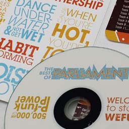
Parliament Album
A wallet-style cd album for Parliament.
I reimagined the design of a 'Best of' release for 70's/80's funk band Parliament. The band projected a big personality: their lyrics were fanciful and they performed elaborately stage concerts playing out their own mythos of characters and storylines.
My design brings the song titles and lyrics to life through bold typographic play. A combination of Avant Garde and Lubalin Graph typefaces, plus faux-vintage fading and color palette helps suggest the era. Inside, an illustration inspired by a gig poster and other album art shows Dr. Funkenstein (concert alter-ego of band frontman George Clinton).
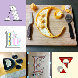
36 Days of Type
Lettering project to design and execute letters A-Z and numbers 0-9 in a span of 36 days.
Over the course of 36 days, I designed the alphabet and numbers as part of a worldwide creative challenge headed by 36 Days of Type. Thousands participated, posting their submissions to Instagram. A small percentage were highlighted on the project sponsor's curated feed. My letter H design was among them. My own Instagram has the entire set at full size, plus videos.
This project is a testament to my creativity and versatility. I approached the challenge with experimentation and variety in mind, employing a wide range of media and techniques working by hand and computer. No two of my pieces fall into the same style. Just to name a few I had papercraft, pen, pencil, food typography, constructivism, art deco, and anaglyph. Some are short videos with lights and mechanisms: M, 0, and 9.
Branding
Assortment of logo designs and concepts.
The first logo is a design for Genevieve V. Beller, a professional designer in live theater. Genevieve specializes in Costume Design and is known for her strong conceptual skills. The mark is a stylized monogram of her initials GVB inspired by her high concept nature and an art deco feel. The geometric sans serif type choice complements the geometry of the mark without overplaying the art deco aspect into something retro. The logo is part of a branding package that includes portfolio website and presentation components. Overall, the clean, modern identity puts the focus on Genevieve's design work.
The second logo is a design for Marcela Suter, a professional photographer. Marcela specializes in event and personal photography such as wedding and engagement sessions. She wanted to emphasize the personal nature of her work and came up with the name "Captured by Marcela." The iconography of a camera is integrated with the typography, mkaing using of the 'C' as the camera lens and matching the geometry and rounded caps of the 'Captured' lettering. The rest of the type is a broad-stroked script that provides a friendly touch for her name. The grey and rose color palette plays to her core business, evoking something romantic and a little feminine but in a sophisticated way that is not girly. Furthermore, it still operates well when restricted to only black or white.
The third logo is a redesign concept for PODS. Current logo in top left corner. PODS provides "Portable On Demand Storage." Their approach to the storage business is to provide containers (such as 8' x 8' x 16') they will transport to your home or office, allow you to fill at your leisure, and then transport back to a local facility or ship elsewhere (even cross-country). I've created a more interesting, contemporary logo for them featuring a stylized box shape. The type projects more energy and is customized with the hexagonal silhouette of the box in the counter of the 'O.'
The fourth logo is a redesign concept for the New York Islanders. Current logo in top left corner. This NHL Hockey team still uses a logo that is almost unchanged from when the team was founded in 1972. In the mid-90's the team went through a rebrand that went disastrously with the fans, causing the team to promptly go back to the old logo. The Islanders are now moving venues to the Barclays Center, which is also home to the NBA's Brooklyn Nets (who also sport a vintage sort of logo). Thus, for my concept approach, I judiciously updated their logo rather than drastically re-imagining it. To circumvent issues related to that circular emblem, I've pulled the "Islanders" name out and allowed the hockey stick to break the boundary. This creates a more readable name and a more energetic mark. The four-stripe motif, symbolic of the four Stanley Cup wins from the Islanders' 1980's dynasty, has been reinforced on the emblem instead of just left as a tiny detail on the hockey stick. Also, the silhouette of Long Island has been removed in favor of the other stronger features that still work when printed smaller or seen from farther away.
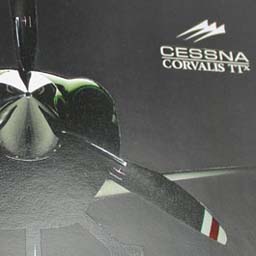
Cessna Brochure
Brochure for the Corvalis TTx aircraft.
The Corvalis TTx is Cessna's top of the line personal use aircraft. I designed this concept brochure with marketing for a high-end sports car in mind.
The visual focus is on Cessna's beatiful, exciting photography, while touting the high performance and luxury features of the plane. Color scheme and flourishes derive from the aircraft styling. Details such as the aircraft spec tables are given due consideration, and touches like spot varnish add a premium finish.
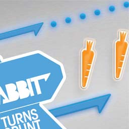
TaskRabbit
Layout design for a magazine article.
Redesign of an existing article that appeared in Wired magazine. TaskRabbit is a company that creates an online marketplace for hiring people to do errands and other odd jobs. They help motivate their workforce, called 'Runners', by using an incentive structure similar to reward systems in video games. Runners accrue points by doing jobs, gaining fringe benefits as they 'level up'. This so-called 'game-ification' informed my layout. A rabbit icon chases down pellets and carrots on the pages, recalling Pacman. On the first page, vector illustration and photoshop techniques are combined to catch the eye. On the following spread, these elements draw the reader through the article, highlighting the infographic asides and pull-quote. The layout was kept consistent with the magazine's styling, such as column and gutter measurements, typeface choice, and master page elements.